7.06 Reading Emblems Every Day
There were many precursors to the fully-formed emblem in popular and learned culture alike, and many related phenomena that suggested emblematic forms of thought. Those that children might have encountered even before they got to school include religious art with mottoes for explication by preachers; flags, festival banners, livery and buildings with the insignia of towns, families, or confraternities; and, at the most basic level of all, coins and shop signs. In their own homes, some children would also have encountered hallmarks or ornamental devices on earthenware or metalwork, family coats of arms, and the ubiquitous personal devices of aristocrats. (15)
The earliest emblem books were not intended for elementary or intermediate classroom use, and in Italy it never became common to propose whole books of emblems for children. Still, the possibility that some were used in classrooms at an early date cannot be excluded. The emblem of the pelican widely associated with Vittorino da Feltre (1378-1446), for example, suggests that he and his successors presented such literary images to boys in his famous school at Mantua. (16) We can be sure that emblems in the form of printer's marks did arrive in classrooms on the title pages of school books. So, even before a student encountered an emblem book, that is, a systematic collection of emblems, he or she would have encountered the emblem form repeatedly. Emblem books were just a way of owning the genre personally. They made the educational activity of reading complex symbols into an object to buy on the market.
Sixteenth-century children probably learned to read emblems actively for the first time in the advertising context we have already explored in earlier chapters, namely the front matter, especially the title pages, of their school books. (See especially sections 1.06, 1.10, 1.14, and 2.08.) By the end of the sixteenth century, when popular prints and posters of all sorts were to be found on display everywhere in European cities, they could also read such emblems in the street with the same active form of reading they learned in school. It is important to understand this everyday emblem dynamic before we delve into the function of the educational emblem and emblem books, because it is clear that emblems in schools functioned both from the bottom up, using simple and familiar symbols to suggest more complex meanings, and from the top down (as more often described in the literature), as a secret or esoteric sort of communication between savants intended to exclude the non-initiate or unlearned viewer. As we will see, some students were given the exercise of creating emblems too, but they could not have done this if they were not already fully familiar with the form.
Medieval European towns boasted a welter of pictorial shop signs. Early modern streets and shops were also increasingly cluttered with printed posters or broadsides announcing everything from royal and municipal laws to the latest news events to public ceremonies and even private ones like christenings, weddings, and funerals. The communicative problem in any poster is to attract members of the target public and keep them standing long enough to get the message. (17)
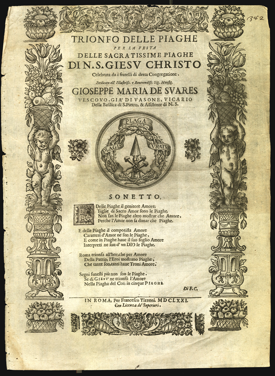
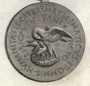
Take, for example, a festival announcement from seventeenth-century Rome for the feast of the Triumph of the Wounds of Christ. It gave the details of a celebratory mass, offered some poetry on its devotional subject, and named the sponsors of the events. The design challenge in such a poster was to make present to a varied public the meaning of an abstract religious doctrine. At the center of the poster is an engraved emblem of the wounds, displaying in solemn fashion the tools of torture. Devotion to the wounds of Christ was a common late medieval practice that would have been familiar to many relatively unschooled folk. (18) The version in this Roman poster of 1671, however, was somewhat removed from popular, late medieval iconography. The wounds themselves were not depicted, only the instruments --the nails, lance, scourge, and crown of thorns. Many popular images, moreover, included the sign affixed to the cross that read "Behold the King of the Jews," the mocking words that were at once a part of the torture and a prophesy of the triumph of Christ.
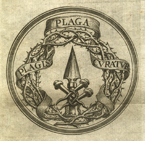
Here we find instead a different verbalization, one that tells us we are to take the image emblematically as well as literally. An elegant banderole woven into the crown of thorns displays the motto Plaga plagis curatur, or "The blow is cured by blows." Other texts on the poster include the names and titles of the noble patron of the feast and an original but unlovely sonnet on the wounds. Note, however, that the longer texts do not explicate the emblem any more than the motto does; these texts merely accompany the image and contextualize it. Some of the words here are strictly information, telling us when and where the solemn mass would be celebrated; others are more celebratory and ornamental. As is usual in emblems, the motto is an essential part of the puzzle. It does not label or explain the picture; rather, it offers one clue to the puzzle represented by the emblem as a whole.
The emblematic symbol of the theological doctrine being celebrated on this feast day is by far the most prominent element on the poster even though the text is fulsome and the layout is complicated by other visuals (borders, putti, flowers). Centering the most important visual may seem an obvious strategy in a case where there is really too much textual information for an effective, fully typographical presentation, but only because we, like the audience for this poster, are fully expecting to locate the meaning in a central, typographically surrounded image. Like them, we have been educated by printers, publishers, and other middle-men to expect certain things in an informational design, among them a strong visual. In this case, the reader is invited to stop and puzzle out the emblem as well as to read the information in the accompanying text. Words, graphics, border, and white space act together to ornament the central, theological doctrine; they contribute to the generally festive character of the event. But all these things also clutter the page visually and intellectually. In this way, by creating several levels of meaning for audiences with differing intellectual pretensions, this otherwise banal festival poster is typical of much early modern graphic and educational practice.
Early modern reading was rarely straightforwardly informational, and so too, reading education was not aimed at finding single meanings. Even when the educational aims were heavy-handedly moralistic, and even when the creators of the works ostentatiously talked down to their audiences, the resulting graphic objects were rarely simplistic. They were multi-layered by design. Their puzzle-like nature derived directly from pedagogical theory that insisted upon multiplicity of meaning. (19)
NOTES
- Open Bibliography
- (15) Daly 1979, 9-36; Saunders 1988, 29-43.
- (16) Gentile 1981, 224-227.
- (17) On early broadside design, Schilling 1990, 285-192; Honemann 1996, 17-24; Rautenberg 2000, 131-134; Eisermann 2003, 162-168, 172-175.
- (18) Duffy 1992, 238-248; Honemann 1996, 20-21 and plate 5; Areford 1998; Henkel 2000, 219-221; Schmidt 2000, 254-262.
- (19) Köhler 1986, 77-86; Scholz 2002, 303-305, 316-327.